
COVID Charts - a no-nonse way of visualizing disease data in the U.S. 📊
- View Source Code
- Mar 2021
- Check it out 🚀
Overview
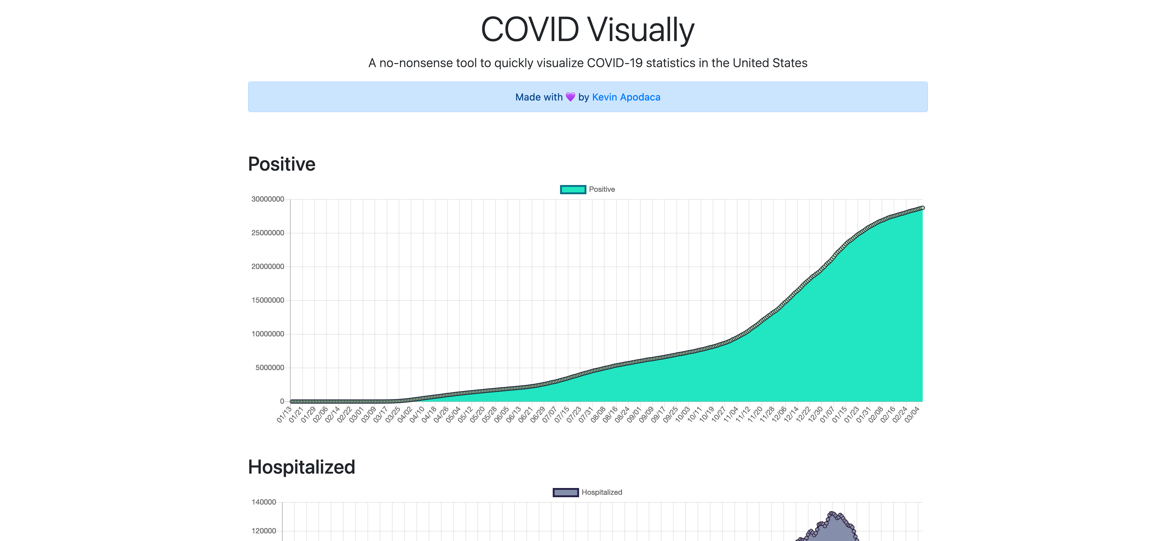
The COVID-19 pandemic is nearing an end, but it isn't over yet. Having a way to quickly and visually see how our country is doing is essential to stay informed.
Data is fetched from the covid-tracking api and I parse the relevant data to use in my application.
I wanted to quickly put together charts that show the data in an informative, clean, and visually-appealing way. Inform, but not distract.
Tech Stack
Axios
To fetch and manage data from API
Vue JS
To develop the frontend and generate site
Bootstrap
To make the app look and feel beautiful
Chart JS
To visualize data using line charts
Babel
To transpile and compile code
Netlify
To host and deploy the application to the web